16 Copywriting Tips for Scannable Marketing Materials

Your readers want to quickly find the information they’re looking for, so create copy that is easy to scan.
How do you stop your audience from scanning and start making them focus on every word you’ve painstakingly crafted into your copywriting?
The answer is: you don’t. Instead, you embrace your audience’s tendency to gloss over the finer details and make your printed marketing as easy to scan as possible.
According to a study conducted by Jakob Nielsen, audiences read printed materials at a significantly faster rate than on electronic devices like tablets. That means your printed materials have to cater to your audience’s tendency to quickly skim through the details.
-
Keep paragraphs short
Using small paragraphs is an easy way to make sure your ad is straight and to the point. Each paragraph of your copywriting should focus on only one idea at a time so that your readers can easily find information.
Keep in mind that there’s no set rule on paragraph length. When you’re done with one idea you can move on, even if you’ve only written two sentences.
And sometimes, a paragraph can even be one single sentence by itself.
-
Use headlines and subheadings to break up information
Using headlines makes it easier for readers to quickly find what they’re looking for. When readers scans your writing, they will often check out each headline to get an idea about what information you have to offer. If you use clearly defined, attention-grabbing headlines, you’ll increase the chance that they’ll go back and read the rest of your content–or at least the parts that interest them.
-
Creating effective headlines
Headlines should be clear summaries of the topics that they cover to make it easier to skim for information. Vague headlines make it harder for the reader to scan your copy because they aren’t given a full understanding of what each section contains.
Instead of short, unclear headlines like “Benefits” or “Special offer,” add a little more detail such as “Earn a free gift” or “Save 50%.”
-
Using subheadings properly
Subheadings let you further break up your information into easily scanned chunks–however, consistency is the key to using them properly. Your subheadings should be smaller than your headlines but use the same font, capitalization and alignment so they are easily identified as being separate from the copy. You can make your subheadings stand out even more by indenting them, as seen in the examples below.
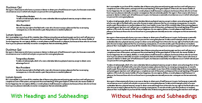
Even with a general glance, it’s obvious that an article that uses headings and subheadings effectively is much easier to skim.
-
Capitalizing headings and subheadings
There are a few schools of thought regarding capitalization and headings, but your best bet is to capitalize them the way you would in a sentence–“Our contact info” rather than “Our Contact Info.” Capitalizing every word (or God forbid, EVERY LETTER) interferes with your text’s readability and therefore makes it difficult to scan.
-
Spacing headings and paragraphs
From a visual standpoint, it’s vital to remember to keep your headings and paragraphs spaced properly. Each paragraph should have a decent amount of space between it and the next paragraph, but each heading and the paragraph it corresponds with should have less space between them. This creates greater proximity, which causes the reader to make a visual connection between them.
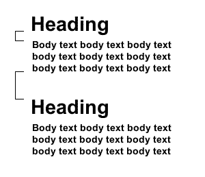
Make sure that the space between your headings and body text is less than the space between individual paragraphs.
-
-
Break down ideas into lists
- Bullets are an easy way to break up a page and make it easier to scan.
- Bullets and lists allow you to divulge a number of information, without worrying about being long winded.
- For example, use bullets when listing off a product’s special features.
- Audiences respond well to copy set up as numbered lists.
- For instance, “7 Unique Holiday Gifts.”
-
Use pictures as visual landmarks

Using relevant images to illustrate your points (for example, a description of a luxury hotel suite in your brochure would naturally call for an appropriate photo).
Pictures not only break up the monotony of your copywriting, they actually help to enhance your points by demonstrating visual examples of what you’re talking about. Images also make your marketing easier to scan because they give the reader easy visual clues as to its content. Adding a caption to your picture gives the reader a quick blurb of information, almost like a small sample version of the copy itself.
Pictures draw the eye directly to the corresponding headline and paragraph, which indicates to the reader that this point is more important than the rest. Therefore, your pictures should always be placed so that they highlight the most important points. Pictures may be worth a thousand words, but you want those thousand words to be speaking your message at all times.
-
Stick to simple word choices
An obscure word or acronym can be a major roadblock for your reader. They might need to examine the surrounding words or grab a dictionary to understand it. They might even skip over your point entirely, which is completely counter to your goal of scannability.
Write with simple words that are common enough to understand but powerful enough to deliver your message effectively. Eliminate jargon and industry terms and focus on making your copywriting accessible.
The following ad copy is too wordy and complicated:
Tired of suffering from an excess of mucus each winter? Come to Thenton Medical Center for your seasonal influenza vaccination.
A better choice would be:
Tired of sniffling and sneezing each winter? Come to Thenton Medical Center for your flu shot.
The second example is more effective because it can be understood by a wider audience and the smaller words save space, making it easier to scan.
-
Eliminate distracting design elements
Giant pictures, scratch-off promotions and other flashy gimmicks will get your audience’s attention, but they will also distract the reader from your message and make it harder to scan for information. If your readers are busy doing something other than reading your copy, then they’re losing out on the information that will convert them into customers.
-
Write using an active voice
An active voice is better for scannability because it’s easier for the reader to understand your message and call to action. Writing using an active voice means that the subject of the sentence is the noun performing the action, instead of the noun the action is being performed upon.
For example, instead of “Your debt can be consolidated by Banner Law Firm,” write “Banner Law Firm can consolidate your debt.”
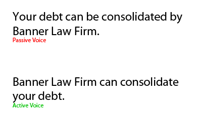
The active sentence puts the brand name in the spotlight, while the passive sentence unfortunately makes the “debt” the star of the show. When making your document scannable, active voice helps to ensure that the most important words always reach your reader first.
-
Write with a conversational tone
Write the way you talk to make your marketing easier to scan for information. People talk using sentence fragments, common expressions and slang terms. Using these techniques makes writing easier to scan for information because people are more comfortable reading it.
Write using contractions instead of spelling out both words to save space and sound more conversational.
Don’t forget, we’re open on Sunday.
is better than
Do not forget, we are open on Sunday.
An overly formal tone works against scannability because formal tone is bogged down by structure. Think about a short formal letter versus a postcard; both might convey the same amount of information, but the formal letter will also include a bunch of extraneous elements like addresses, formal greetings and signatures that distract from the message.
-
Use the right font and typography
 An attractive, simple font is best for your printed media because it’s easier to read and therefore easier to scan. Fancy fonts might look nice for logos, but they’re difficult to read when used in headlines or copy.
Use a sans-serif font like Helvetica for headlines and sub-headings, with a serif font like Times New Roman for the content itself. This has been proven to be the most effective way to use font in printed materials to maintain readability. The slight variation in the font styles makes it easy for readers to differentiate between the two elements. However, avoid using more than two types of font in your print media at one time.
Bold, underline or italicize your most important points so that they stand out on the page when the reader is scanning. However, these typography styles should be used sparingly as overuse will draw the eye to multiple points at once, making the copy less effective.
-
Size matters when it comes to font
The size of your font is dependent on the medium you’re working with, but there are some general rules of thumb you need to follow. For starters, your font should always be legible without making the eye work too hard to scan your copywriting. That said, you cannot choose a font that’s so big that it takes up all of the design space.
Instead, you want to use a combination of small and large fonts to bring greater emphasis to certain points. Typically, your text should be anywhere from 10 to 12 points in size; that may change depending on your medium and audience. Your headlines should be big and bold, with your subheadings being somewhere between your headlines and your body text.
It’s not just your headlines you want to make bigger, you also want important information like your phone number to stand out. You can also increase font size to make important points stand out and decrease the font size of less important copywriting, like your legal disclaimers.

-
Add whitespace to your writing
Give your ads some room to breathe with plenty of white space. As we’ve mentioned before, white space helps the brain process information because it helps separate different ideas. A large paragraph with no breaks is hard to understand and almost impossible to scan.
Too much whitespace can have the opposite effect on your marketing. When your points are too spread out, it’s harder to focus on what’s essential. White space should be used to draw attention to your most important points so that they stand out.
Micro whitespace is the term given to the space between characters, words, lines and paragraphs. Using effective micro whitespace increases the readability of your business writing by making your eye see the words more clearly. Words and characters should have enough space in between so that they don’t overlap one another on the page. Paragraphs should be single-spaced, with a double space in between to indicate a new paragraph. Important points should be surrounded by more white space to increase visibility and add emphasis.
-
Use proper indentation
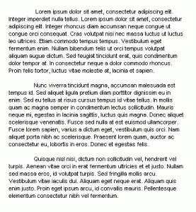
Indentations allow your individual paragraphs to stand out. If you use them, be sure to use them consistently.
Indentation adds whitespace to the beginning of a paragraph to give it distinction from the paragraph that came before it. This is a must if your writing does not make use of headings or subheadings; the first line of every paragraph should be indented in your printed copy.
However, a paragraph following a headline should not use indentation because the headline is enough to distinguish the paragraph from others. A heading above an indented paragraph creates a misaligned effect that looks odd; if you have more than one paragraph under a single headline, indenting will confuse your reader as to which heading goes with which text and will not help scannability. Rather than indentations, use sufficient white space between each paragraph to divide them up.
Adding a greater indent to a portion of your copy allows that point to stand out, drawing the eye to it when scanning. This is often used to indicate a quotation or a special point that requires greater emphasis.
-
Emphasize call to action
After supplying the reader with information, you want a powerful call to action that gets him to take the next step towards a conversion. These calls to action should be prominently displayed so they’re easily scanned.
If your call to action is to get a customer to visit your website, make sure your web address is given emphasis with a large, bold font and plenty of whitespace. If your call to action is to get a customer to come in to your location, emphasize this with a picture of a map indicating where you’re located.
These are the details that get your readers to convert into customers, so they should stand out enough to be quickly read and understood. A recipient should be able to understand and respond to your call to action right away, even if they set your materials aside and come back to them later. The more time they spend looking for your website or location, the more time they’ll have to rethink their decision.
-
Deliver information quickly using an inverted pyramid writing style
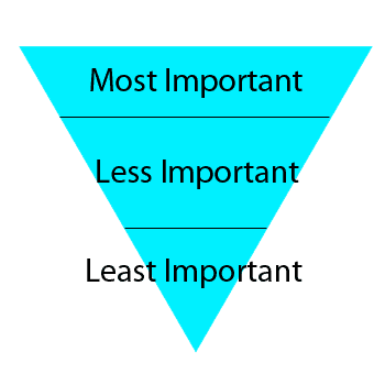
Make your copy easier to read by placing information in order of most to least important.
Write with an inverse-pyramid style, where you deliver the most important facts first and fill in the details later. When scanning for information, your audience will usually read the first few lines of a new paragraph to see what it’s all about.
If those first few lines contain the bulk of the information you want to share, then your message will still get across even if the reader stops before reaching the end. There are no surprise endings in copywriting–your copy should be straightforward from the beginning, similar to a newspaper article.
-
Properly align your text
English is read from left to right, so it’s easier for an English speaking audience to scan information written with left alignment or justified margins. Left alignment is the standard for most business writing. However, justified margins are best when you have multiple columns of information; each column will be arranged in a way that creates a straight line on either side, helping you seperate it from other columns.
Keep your alignment consistent throughout the entire piece. Don’t switch between two different alignments for your headlines and body text as it confuses the eye.
-
Know when to employ scanning tactics
Not all text benefits from being easily scanned, so know when to employ these tactics and when to hold back. When listing off the technical details of a product, for instance, it’s better to frame the information as a list so readers can quickly skim or skip over the section. However, a legal disclaimer would need to be written out in full detail so that the reader understands the full extent of its meaning.
When readers scan for information, you want them to pick up on your most important message and call to action. Don’t focus your most scannable elements — your headlines, pictures and so forth — on the smaller details. The idea is when a reader scans your article, he should know what you’re trying to say about your brand and be compelled to act on your call to action.
Conclusion
It’s important to keep in mind that over 50% of Americans read at an 8th grade level or lower. You don’t want to potentially lose half of your customers with marketing that is too dense or too challenging. Take heed of these tips and techniques; copywriting that is easy to scan ensures that it will be effective with any type of audience.
Posted in Copywriting
Don`t neglect your friends, share this right away.


either use indentation OR space between paragraphs