Character Spacing (Kerning) Gone Bad
Simply put, kerning is the space between pairs of letters. Good kerning means even spaces. Bad kerning means huge gaps between some characters and none between others. It’s a mistake that most designers make from time to time. Maybe they were in a hurry. Maybe it was just an oversight. Maybe they weren’t giving it the attention it deserved. No matter the reason, kerning is a critical part of fundamentally sound design.
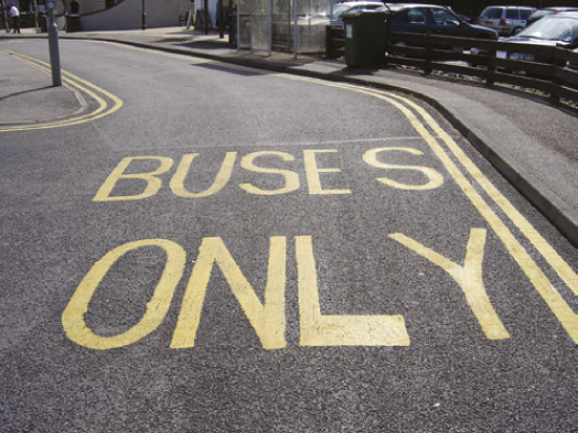
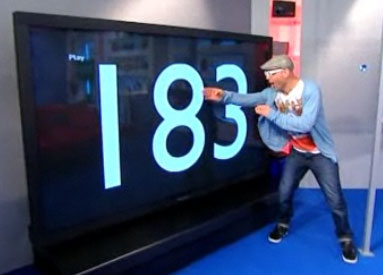
Bad kerning looks lazy and gives the impression that care wasn’t taken when putting a project together. Worst of all, it looks unprofessional. The sad thing is that of all the problems that a designer can encounter, it’s one of the most avoidable. Take a look at some of the more outstanding offenses:


Solving the Problem
Any professional grade graphic software has the ability to adjust kerning. Here’s where the adjustment can be made in some major programs:
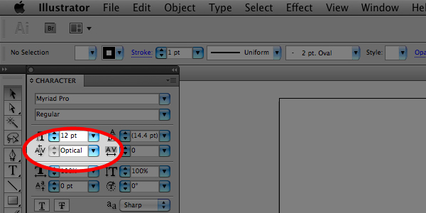
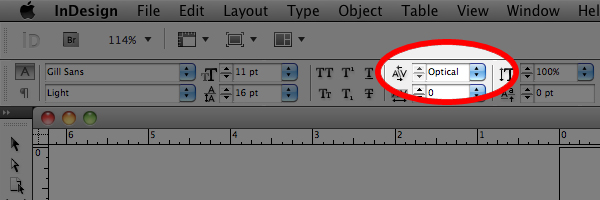
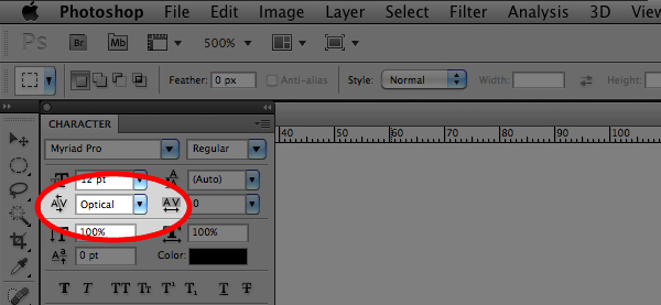
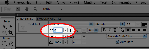 At the very least, “Optical” should be selected in the Character panel – this goes a long way toward fixing the errors
that default settings can create. At the same time, it doesn’t completely solve the problem.
Constant checking is needed to ensure that everything is spaced properly. There will be instances where fine tuning will have to be applied. This means adjusting settings using the kerning tool.
When using Fireworks, older versions of the Adobe Creative Suite, or programs that don’t have the “Optical” setting, manual adjustments will have to be made from the beginning of the project. Either way, the end result should be properly spaced type.
Sound Design
Sure, kerning can look like a small thing, and truth be told, it’s not the worst mistake that someone can make. Kerning might not be noticed if it’s done right, but it will be hard to miss if it’s done wrong.
Posted in Design Tutorials, Illustrator Tips & Tutorials, InDesign Tips & Tutorials, Photoshop Tips & Tutorials
Don`t neglect your friends, share this right away.


Leave a Reply