How Burton Snowboards Logo Reinforced Their Business
Since starting out in 1977 in a borrowed wood shop in Stratton, Vermont, Burton Snowboards has had no fewer than 100 logos or brandmarks. It’s hard to argue with their strategy. They sit atop the multi-billion dollar snowboard equipment and apparel industry – an industry which they practically invented. With sales estimated to be in the neighborhood of $700 million, they easily are the largest and most recognized snowboard brand in the world. Take a look at this Burton logo history:
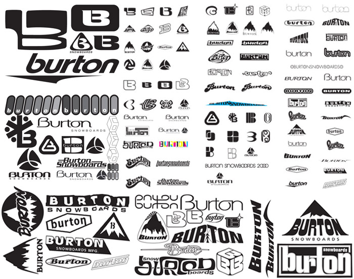
Burton would go long stretches, especially in the mid 1990s to early 2000s, where they would redesign or discard multiple logos every year. Their constant re-branding enabled them to look like they weren’t content to sit still, that they were growing and changing, while reflecting the progressive, boundary-pushing nature of snowboarding itself and the riders that made up its core.
While this method no doubt appealed to Burton, their apparent change for the sake of change could appear confusing and indecisive to the outside world. As a lifestyle brand, certain products were geared to younger people. In a lot of cases, this meant Burton was dependent on parents to buy them – parents who weren’t necessarily the educated consumers that their children were. A parent that saw a different logo in the store than the one on the poster in their child’s room could cost the company a sale.
The 2001/2002 season was especially important to the business. With Salt Lake City hosting the Olympics in February, the sport and Burton would be on display. Snowboarding was already enjoying a rise in popularity following its introduction to the games in 1998 in Nagano, Japan and the company got a boost from their sponsorship of Bronze medal winner Ross Powers. Burton needed to capitalize on that momentum in a way that would build their brand.
The Rise of the Arrow
Burton’s solution was to create a bold, iconic mark that would define the brand for years to come. The idea that was put into place was the ubiquitous Burton Arrow. The logo itself was the perfect solution and a great example of professional logo design from a team as creative as all those daredevil snowboarders. Ten years later, it’s still a timeless icon. What made this such a great fit came down to five key areas:
 Describable:
The design is easy to explain – a lower case B with an upturned arrow. Anyone could communicate it to someone who had never seen it before, and they’d have a good idea of what it looked like based solely on that description.
Memorable:
The more elements that make up a logo, the harder it becomes to remember. Less elements means a higher rate of recognition. The simplicity and striking nature of the Arrow makes it easy to recall, even if you’ve only seen it once. By creating a mark based off of the letter B, Burton created something visual that still related to the company’s name. This, in turn, further reinforces its meaningfulness.
Scalable:
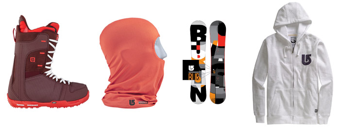
Due to the wide variety of products it would be featured on, the logo had to appear clear regardless of size. Flexibility was key. This is another area where this mark excels. Burton’s logo is discernible on every item it’s placed on, no matter how small. Also, because of the bold design and simplicity of shape, when the Arrow is scaled up to a large size, it has even more impact.
Effective Regardless of Color:
Again, considering the varying items that the logo could be placed on, as well as the potential different colors that it could be interacting with, it had to be recognizable no matter the situation. The Arrow’s clean shape allows for maximum visibility, to the point where it can be shown as a simple outline and still be easily identified.

Relevant:
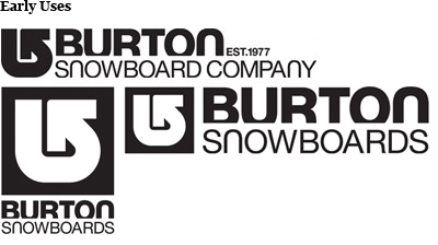
For years Burton had been using a stylized letter B in countless different logos.
Take a look at some examples:

The introduction of the Arrow furthered that trend in a way that was consistent with the history of the brand. While the mark was different enough to still be a departure, it maintained the look of something that fit Burton’s image in a meaningful manner.
Burton Sees Results in the Marketplace
The impact of Burton’s move to the Arrow has been felt in a few different ways. The logo portrayed a focused and straightforward brand image. This provided a more consistent message to consumers. As time went by, the new logo helped to clear up any confusion in the marketplace about what brand a parent, or anyone else for that matter, might actually be buying – there would be no mistake that it was a Burton product.
One of the biggest assets that the redesigned logo gave Burton was the ability to use one mark on the majority of their products. This saved them a small fortune in and of itself. Not only did it eliminate the expensive process of designing multiple logos every year, it also cut down on the different molds and dies that have to be made for each mark. Along with this came the fact that, on the surface at least, product lines would appear more similar from year to year, due to their more unified appearance. While certain segments of the market would always buy the newest and latest gear, the logo helped Burton to move out the inventory of older items due to their resemblance to newer products.

 The visibility the Arrow was given during the 2002 Olympics was massive. Two Burton sponsored athletes, the previously mentioned Ross Powers as well as Kelly Clark, both won the first Gold medals in snowboarding for the United States. This put the company front and center on a global stage. The newly minted logo would be featured prominently in countless photos of the two, raising Burton’s profile like never before.
 That year also saw the emergence of one of the sport’s largest stars in Shaun White. His meteoric rise would include back to back Olympic Gold Medals in 2006 and 2010 as well as countless victories at the U.S. Open and Winter X Games, all under the sponsorship of Burton. This connection helped to further promote the logo, reinforce the brand and put the company in front of a larger audience as time went by.
While there have been slight refinements to the logo over the past 10 years, the enduring use of the Arrow has helped to further solidify Burton’s place as snowboarding’s market leader.

Posted in Branding, Logo Design, Logo Design Tips, Marketing
Don`t neglect your friends, share this right away.




Leave a Reply