How To Give Your Folder A Color Background That “Pops”
Presentation or file folders with a color background can really help images stand out. A solid color that complements or contrasts with your foreground adds interest and gives your folder a strong, vibrant look. But there are several things to carefully consider when designing a folder in this way.
 Many people think that the best way to achieve this type of look is to use a colored stock. This works well when foil stamping or embossing your image, but printing is another matter altogether. Because inks are translucent in nature, their color value will be greatly altered when printed on a colored folder stock.
For example, if you try to print with white ink on a red stock background, the ink will appear as pink instead. Similarly, printing a yellow and green logo on blue stock will result in colors that don’t look quite right. This also applies to printing a full color image; try to print a photo of a nice, clear sky on grey stock, and it’ll end up looking like a cloudy day.
Background For Pantone (PMS) Color Images
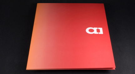
The solution lies in understanding how to prepare your artwork. The truest color values come when printing colors on a white stock. So when you want a black background, for example, begin with a white stock. Select your black background PMS (also known as Pantone Matching System) color and use it to fill the entire outside of your folder with your design “reversed out.” Your logo or type will appear white because it is, in fact, the only unprinted part of the white folder stock.

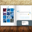
Background For Full Color (CMYK) Images
When preparing artwork for printing your full color image, you’ll want to build your background color (orange, for example) into your CMYK (full color) files. There are ink formulas available that can closely match the PMS orange that you have selected for your background color. Again, the stock is white so that you get the truest, most vibrant color reproduction. Just as with our other example, any white parts of your image will be “reversed out.”

Source: Reinforced Pocket Folder
If done right, a color background can give your folder a dynamic and eye-catching appearance. As a general rule, using white stock printed with a color background that complements your central image creates a very crisp and attractive look.
Posted in Folder Designs, Print Design
Don`t neglect your friends, share this right away.

Our marketing, design and printing experts are passionate about sharing their knowledge. We're eager to help make your vision a reality in print. Be sure to explore the rest of the Printwand blog for more reliable, easy-to-understand information.

Leave a Reply