What’s the Hidden Meaning Behind Your Logo Color Scheme?
 Whether you’re conscious of it or not, the colors that you use in your logo or other design have certain hidden meanings and symbolism. Simply seeing a specific color can conjure up specific emotions and feelings in the mind of the viewer.
For that reason, graphic designers tend to choose a color scheme very deliberately. Picture the most popular logos you can think of, and imagine if they had been created using different colors. Would the McDonald’s “golden arches” be as effective if they were blue? Would your favorite “green” company seem as eco-friendly if its logo weren’t actually green?
The wrong color can send your audience mixed messages. Instead of just spinning the color wheel and picking hues that look pretty, it’s best to choose a logo color scheme with meaning relevant to your product or service.
Want help creating a custom color palette for your company? Our experienced logo services team will create a stunning original design that matches your brand identity.
Be aware that we’re assuming your business is targeting a primarily American audience; colors can have different connotations in different countries (pink, for example, sometimes symbolizes masculinity in Japan). With that in mind, let’s take a look at the psychology of colors and how they can be used to express a certain mood, emotion or meaning.

- Love, passion, sexuality
- Heat, fire, energy
- Action, danger, violence

Nearly every fast food logo features the color red as a prominent element.
Since it’s a “warm color,” red is often used in association with yellow or orange to create logos for restaurants, especially fast food. “Seeing red” tends to make people hungrier; this is likely because the most scrumptious types of food (such as steak and ripened fruit) contain red tones.
Red is also used to give products a sense of vibrant passion and power, so it’s a popular color in nearly every type of advertising, particularly the auto industry. It’s a good color to use when you want a certain word, phrase or element to really stand out.

- Happiness, fun, friendship, youth
- Heat, fire, energy
- Autumn
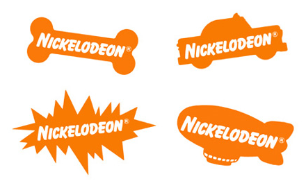
Orange is Nickelodeon's signature color. It gives each logo a fun, playful feel.
Like red, orange is an energetic color that suggests heat, though it’s slightly more muted and less intense than red. It projects a more youthful meaning, and it’s often used to promote children’s media and toys.
Pairing orange with darker colors such as black or brown creates a autumnal color scheme. This can be useful for more seasonal companies, but be careful using these color combinations if you don’t want people to associate your brand with Halloween.

- Sunshine, cleanliness, comfort
- Happiness, youth, optimism
- Caution, alertness

Yellow can have different meanings depending on how it's used. It can suggest happiness and joy, or it can signal a warning.
Yellow is a light, happy color; in fact, it’s the lightest hue on the color wheel, which makes it one of the best colors for grabbing a person’s attention. That’s why you see it used on many street signs and taxicabs; it’s noticeable even from a considerable distance.
Darker shades of yellow are usually considered “gross” looking, and tend to make a logo feel antiquated and stodgy. Yellow earth tones, however, can be useful for “natural” products such as health drinks.
Yellow (along with green) is sometimes used in the branding of cleaning or hygiene supplies. It obviously comes in handy when a product is “lemon-scented,” but it also helps create a bright, clean and “shiny” feeling that makes cleaning and hygiene products more appealing.

- Nature, cleanliness, refreshment, renewal
- Affirmation, comfort, security
- Money, health

Green is often used by companies that specialize in health, money or nature.
Green has a meaning commonly associated with the natural world, making it perfect for environmentally focused companies or any product designed to create a feeling of “freshness.” Cleaning supplies, hygiene products, beverages and mint candy all tend to use green in their identity design.
Darker shades of green are often used to create a sense of security and safety. For that reason, insurance providers, banks and pharmaceutical companies tend to use green in their logos.

- Nature, cleanliness, refreshment, coldness, water, sterility
- Serenity, security, authority, stability

Corporate logos are often blue, especially when the company specializes in technology.
A blue color scheme is used in many corporate logos because its meaning evokes a feeling of professionalism and loyalty. People trust the color blue, which is why it’s the dominant color in many police uniforms. Seeing the color blue creates a calming effect, and it’s the overall most popular “favorite color.”
Because of its association with water and clarity, blue is also a color of choice for refreshing beverages, as well as hygienic products such as soap and toothpaste.

- Royalty, nobility, elegance, decadence, wealth
- Creativity, magic, fun, flamboyance
- Femininity

Royal purple goes well with Hallmark's "crown" motif. It's also a natural choice for the quirky Red Hat Society, who are known for wearing purple dresses.
Favored by rock stars such as Prince and “offbeat” organizations such as the Red Hat Society, purple has a meaning associated with creativity and artistic spirit. It’s a somewhat uncommon color for logos, but can be used to express an unconventional, flamboyant style.
Purple is widely regarded to be the color of royalty. As opposed to blue’s more serious, authoritative tone, purple exudes extravagant wealth and luxury.

- Femininity, love, sexuality, LGBT culture
- Fun, youth, flamboyance
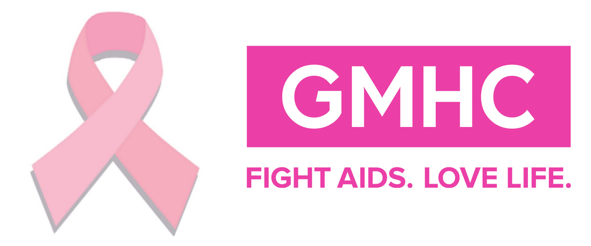
Pink is often associated with women's health; pink ribbons are a symbol of breast cancer awareness, for example. Similarly, this logo for Gay Men's Health Crisis uses pink to resonate with the LGBT community.
Being almost exclusively associated with women, pink is a popular logo color for female-targeted products, such as yogurt, feminine hygiene products and toys for young girls. It can be seen as a “softer” version of red or purple, with many of the same meanings but less intensity.
The color pink also has a strong connection to the LGBT (lesbian, gay, bisexual and transgender) community, and is often incorporated into the branding of LGBT events and organizations.

- Nature, autumn
- Practicality, dependability, simplicity
- Decadence, comfort, elegance, sensuality
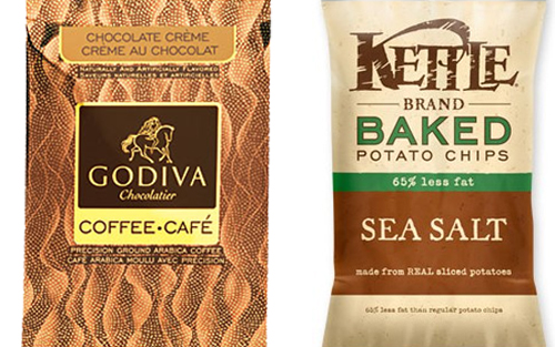
Brown can suggest richness and decadence, but it can also help present a natural, down-to-earth image.
For obvious reasons, rich brown logos are frequently used to sell coffee or chocolate. With the right presentation, an earthy brown can signify subtle, muted elegance and a “high class” image that’s well-suited for rich, sensuous products.
Brown is known for being “earthy,” both in the sense of the natural world and being “down to earth.” UPS famously uses a brown color scheme to brand themselves as reliable and no-nonsense. Also, when you want to brand “natural” or organic products, brown (along with other earth tones) can be a less plant-like alternative to green. Baked potato chips, for example, often have brown in their packaging design to make them appear healthier and more natural.

- Darkness, mystery, alternative culture
- Elegance, formality, luxury, power
- Simplicity, authority, stability

Hot Topic uses black to appeal to the alternative youth culture. Meanwhile, Lexus uses a simple black logo to express power and luxury.
Many companies create their logo in black before using any color on the color wheel; this ensures that it will still be understandable even when printed in black-and-white. However, sometimes the usage of black in a color scheme is a deliberate choice based on its meaning.
Black is a “cool” color; not in the sense of temperature, but of style, fashion and attitude. Rock bands sometimes implement black in their branding to appeal to people’s “darker” nature. Many alternative subcultures are associated with black, such as goth and punk.
Like blue, black has a calming effect, but with an underlying sense of mystery. It’s simple, but also bold and authoritative. Thus, corporate branding is often done in black to present an image of power and strength.
Posted in Logo Design, Logo Design Tips
Don`t neglect your friends, share this right away.





excellent article, helped me out alot…
Thanks, glad to hear!
This is an excellent article. The contents are very specific and easy to understand. You may add more logos, especially not so popular because in most articles only popular logos are shown.
Thanks, we appreciate the feedback.
A permanent bookmark for me – great use in my graphic design coursework!
What about WHITE
White is a neutral color but represents purity, innocence, clarity and purity. It can add exclusivity and luxury to your design.