White Space in Graphic Design, and Why It’s Important
When was the last time you actively considered the role of nothingness in your life? We generally focus on the tangible–however, a strong design requires careful attention to both what’s there and what isn’t there. White space (sometimes spelled “whitespace”) is integral because it tells our brains which elements in the design are the most important–it helps us process these elements, both on their own and as part of the overall image.
What is white space?

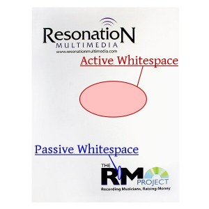
A diagram representing the difference between active and passive white space.
White space refers to the canvas space left in between different elements of your design. You may have also heard it referred to as negative space. It’s important because it keeps your design from being too cluttered or too confusing. There are two major types of white space in graphic design:
- Active White Space – This is the space that you make a conscious effort to add to your design for emphasis and structure. Active white space is often asymmetrical, which makes the design look more dynamic and active.
- Passive White Space – This is the white space that occurs naturally, such as the area between words on a line or the space surrounding a logo or graphic element.
When dealing with white space, you will mostly be concerned with the active white space—-however, you still have to pay attention to your passive white space and how it works with your overall design.
Whitespace size: micro vs. macro
Micro white space is the term used to describe the smaller elements of white space in a particular design. It might be the space between letters and words or between two graphic elements next to one another. Add micro white space whenever your design needs a little more breathing room but you don’t have enough canvas left to work with. Tweaking the amount of space between your smallest elements will help them to become more noticeable and improve your design so that it doesn’t look so cluttered.
On the other end of the spectrum, macro white space is the term given to larger volumes of white space. These are the negative space elements between columns, paragraphs or graphic elements. If you look to the left and right of this paragraph, you can see macro white space in action as it separates the different elements of the web page. Changing these areas will drastically alter the look of your design, giving you a number of different options for creating design flow and rhythm.
It’s not always white

Don’t let the name fool you; white space can be any color or pattern you like.
The term “white space” is actually a bit of a misnomer because it implies that the space has to be white in color. White space can actually be any color that represents the negative space in your design. For example, a presentation folder might use a bright hue like yellow in place of white to bring energy and color to the design. White space can even have a repeating pattern (like a subtle texture) to make it more visually appealing. Colored whitespace is more interesting to look at than plain white, but the principles are still the same—it’s an area that you don’t want the eye to focus on.
The importance of whitespace
Negative space performs several vital duties in making your design attractive and effective.
-
Separates and groups elements
White space provides the brain with visual clues as to which graphic design elements belong together and which are separate. Let’s say that at the bottom of a business card, you have a series of phone numbers for your business, cell and home phones. The micro white space between the different lines of numbers give your brain the signal that each is a part of a new and different sequence instead of one long number. Space is also used to separate each individual character from the rest, making them legible and easy to comprehend.
On the other hand, adding macro white space between different groups of phone numbers will allow your brain to process each group as a separate entity, making it easier for you to organize a large amount of design elements at once. Using the same example, you might reserve the left side of your design space for work numbers, with the right side for home numbers. Adding macro white space between these two groups makes it easier for recipients to tell the difference between the two, even if they have similar visual elements.

-
Implies luxury and sophistication

White space can be used as a design element to make your marketing materials look sophisticated.
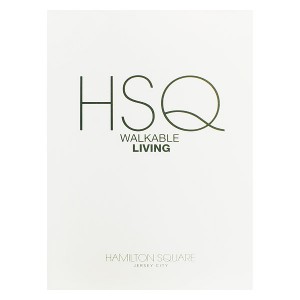
White space can actually become a central element in a design when it’s used to create a certain mood or look. We associate a large amount of white space with luxury and sophistication, so using it effectively may be a way to bring these associations to your design.
Consider eating out at a five-star restaurant versus a cheap family diner. At a fancy restaurant, the food is arranged neatly on the plate with plenty of white space, while the family diner piles all the food onto one plate with little room for anything else. The same idea goes for your design—too many graphic elements cheapen the overall look. Rather than trying to improve a design by adding more and more imagery, let the white space do its job so that you can simply focus on making the graphic elements look their best.
-
Adds emphasis
What happens when you separate a design element using white space?
As you can see from the text above, our brains tend to put emphasis and importance on design elements that are surrounded by white space. This is because the negative space is giving you visual clues about where you should be looking, providing plenty of buffer room around an element so that your brain can quickly process it.This is why important design elements like logos are often surrounded by white space, so that they are emphasized and clearly visible. The space helps keep your logo separate from other elements, so that the viewer is drawn to your branding and doesn’t confuse it with other images.

White space leaves room for the imagination. Photo: Tom Raftery
-
Invokes imagination
When we see white space in a design, it allows our imaginations to roam free, which results in a stronger emotional response. Our brains have an innate need to figure things out, which creates a sort of narrative between what you see and how you process it.
In the example to the right, we have a woman trimming a bonsai tree in what looks like complete emptiness. However, we know she’s can’t actually be floating in a void, so our brains create a story to tell us what’s happening. Maybe you imagine her working at the back of a greenhouse or maybe she’s trimming the bonsai in a white-walled office on a sunny day. Maybe your brain even imagines her as a model for a picture posing in front of a white back drop.
What your mind imprints onto that white space doesn’t actually matter; what matters is that thinking about it engaged your mind. If you’re engaged, then you have a personal investment in the design. Having a personal investment in the design makes it more likely to create a good first impression.
-
Creates a negative space image
It’s also possible to create an image using the negative space between graphic elements. This is a creative way to add a symbol to a logo in a subtle, almost “subliminal” way; the image might not be immediately apparent, but it will cause viewers to pay extra attention to your design.
In the example logo for a landscaping company below, the “U” in the word “Doug” has a hidden shovel design created by the unique shape of the white space. The imagery ties into the nature of the business and gives the design a subtle graphic element without going overboard. Had the shovel been a picture or clip art, it would completely change the minimalist aesthetic of this logo.

White space can be used to create a negative image, such as the hidden shovel in this logo for a landscaping company. Photo: Graham Smith
Conclusion
Whatever you do, don’t fall into the trap of thinking of white space as “empty space.” It may look empty, but that’s because you designed the space to give viewers a better look at your design, not because you didn’t have anything better to put there. When it comes to graphic design, the elements you leave out are just as important as the ones you create.
Posted in Print Design
Don`t neglect your friends, share this right away.


Leave a Reply