6 Excellent Press Kit Packaging Ideas
“It’s what’s on the inside that counts.” Many of us would love to believe this; it would be awfully refreshing if substance and character were all that mattered for making a good impression. But like it or not, when it comes to creating press kit packaging, appearances matter a great deal. Even if the contents of your press kit are top notch, they might never get seen if your press kit folder is forgettable and unprofessional-looking.
The shape and design of your media kit has a major effect on how the recipient perceives your company. If it’s cheap and shoddy-looking, your company will look cheap and shoddy. Conversely, if you put plenty of thought and care into your press kit folder design, then media professionals and investors will be much more likely to take notice.
Here are some invaluable tips to make your press kit packaging just as impressive as its contents.
-
Choose a container that fits
The size and quantity of materials in your press kit can vary greatly depending on the size and scope of your company. You want a container large enough to hold everything you need, but you also don’t want something too large or it will end up looking sparse and empty.
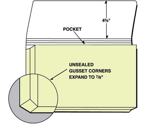
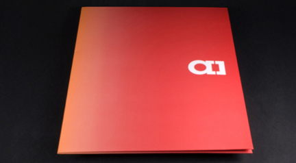
For some organizations, a standard presentation folder will be enough to contain everything in your media kit; it can even accommodate special materials such as CDs or flash drives. For larger press kits, you might want an expansion portfolio, sales box or tote. With these, you can include even more paper documents as well as irregularly shaped objects such as promotional products.
-
Keep it organized
Imagine a reporter opening up your presentation folder and the first thing they see is… your financial statements. Sounds like this is one press kit that wasn’t organized properly.
No matter what sort of folder or box your press kit is packaged in, the most “introductory” information should be at the forefront. In most cases, this will be your pitch letter, followed by a fact sheet that details what your company does and its history. The rest of your kit (newspaper clippings, financial documents and other supporting details) should be similarly ordered in a way that makes logical sense. When everything is neatly organized, it makes your press kit that much easier to read.
-
Use a high-quality stock
You wouldn’t hand someone a resume printed on lined looseleaf. In the same sense, the stock that your press kit packaging is printed on has a subtle but significant effect on the recipient’s impression of you. Your press kit folder (as well as all of the documents contained within) should be made from paper of utmost quality.

Just like a person's outfit can tell you a lot about what they do, your press kit's "outfit" should give people an idea of what you do.
A high quality folder stock such as marblecoat or gloss gives your press kit a professional edge. Try using specialty coating textures such as satin or soft-touch for added elegance. You should also consider using recycled and other eco-friendly stocks, especially if you want your company to put forth a “green” image.
-
Be consistent
Keep the style of your press kit folder design consistent with the traits of your company and your other materials. A health care provider’s media kit wouldn’t look very professional draped in a pink-and-purple confetti pattern; nor would an entertainment company seem very entertaining with a plain black matte folder. Additionally, creating press kit packaging in a style completely different from its contents can be a little disorienting.
As a general rule, try to make your media kit’s design match its character. Just as you probably feel most comfortable in clothing that matches your personality, your press kit will be most effective in packaging that compliments its content.
-
Print your contact info
Your press kit should enable the media to easily reach you even if pieces of it are separated from the rest. For that reason, everything in your kit should have your contact information on it — including your packaging. Your press kit folder, box or tote should be professionally printed with your company’s name, address, phone number, fax number (if applicable), URL and e-mail address.
-
Think outside the box
 Your press kit packaging doesn’t need to have a standard, bland design; you might want something that stands out and really grabs the media’s attention. This doesn’t always mean a loud, colorful design; it could be as simple as stepping a little outside your normal comfort zone.
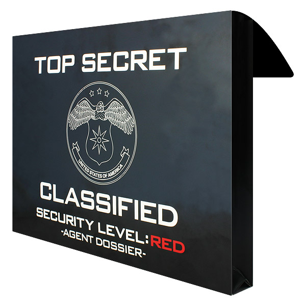
For example, we at Printwand helped Sony to create a press kit portfolio for the Angelina Jolie movie Salt. Notice that the exterior of the folder doesn’t actually mention the title of the movie; rather, it’s designed to look like a secret government document to match the movie’s theme of espionage and intrigue. It still ultimately conveys the spirit of the product, but it makes you curious to open it even if you’re completely unfamiliar with Salt.
Just because a press kit is simple or professional-looking doesn’t mean it should be boring and conventional. Try to create a design that piques interest and compels people to look inside.
Conclusion
Your first priority should always be to create a media kit that gets people talking. Content is key, but a distinctive press kit folder, box or envelope design shouldn’t be overlooked. Proper packaging can make or break your media presence, so make sure that your press kit looks its best.
Posted in Envelope & Packaging Designs, Folder Designs, Marketing, Print Design, Public Relations
Don`t neglect your friends, share this right away.


Leave a Reply